OVERVIEW
Have you ever felt happy by sharing your knowledge with others?
Sensei is a platform where you can share your experience with the people who are seeking specialized knowledge.

TIME FRAME
Design 3wks
ROLE
System Design
Interaction Design
Visual Design
Motion Design
TOOLS
Figma
Adobe XD
Illustrator
Photoshop
After Effect
MENTOR
Daniel Levine
David Vasquez
Problem and Challenges

Experts are willing to have calls with learners but they think going through the sign up and scheduling takes too much of their time.
Research Summary
67%
“According to the research, individuals face difficulty in finding a mentor with whom they can discuss their thoughts and ideas.”

Affinity Map
To extract the insights from the user interviews, listed out the main goals and frustrations.


HMW Statement
Pursued three main goals to maximize users' return from Sensei.
How might we help users to spend less time on scheduling for the 1-1 mentor calls?
How might we help users to earn extra money with their personal experience?
How might we help users to connect with people who are looking for specialized knowledge?
Created based on the user’s concerns and needs, considering their expectations. *Showing 3 out of 16 user stories
User Story

As a user who has built a decent career, I want to add my career history to let the learners know their capabilities in their field.

As a user who likes giving career advice, I want to register myself as an expert, so I can earn extra money through mentorship.

As a user who is an introvert, I want to get some help in scheduling calls with people while using a platform.
Site Map
Developed Sitemaps for both experts and learners to explore the two different directions of navigation and how to organize the contents.


Focused on creating an expert’s user flow to build an onboarding flow that will encourage experts to speed up their signup process.
User Flow

Sketching allowed me to iterate many variations of showcasing the features to find out the design that will encourage users to finish the flow fast.
Sketches
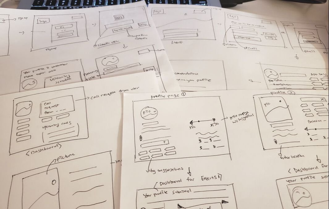
Low Fidelity Wireframes
The first usability testing was to find out the basic usability issues.

1st Usability Testing
I have conducted 1st Usability Testing with my low fidelity wireframes to find out any basic usability issues.


Feedback from user: “I might exit out of the sign up process if the tax/fee notice is too visible.”, "I might click skip button by accident when I want to click next."
Changes: Tax and fee deducting message moved below the box. Moved skip button to the left top corner to prevent users from pressing skip by accident.
From this first usability testing, I realized that choosing what information should be less visible is as important as choosing what to emphasize.
Designed a style guide for more visually appealing signup flow by planning out the colors, fonts, icons and buttons.
The design process was iterative, but it resulted in delivering trustworthy messages.
Style Guide

I have conducted final Usability Testing with my high fidelity wireframes to find out any noticeable usability issues.
2nd Usability Testing


Feedback from user: “How many more steps do I have to complete?”, "It's unclear about LinkedIn profile sync."
Changes: Side column status bar implementation for all of the screens
From this final usability testing, I found out that users want to be notified about the current situations
Prototype Video
High Fidelity Wireframes

Next Steps

Learner’s signup flow, will me my next task, where they can easily get matched with experts.
My profile page for both experts and learners.
Explore better option for the calendar sync.
Other Projects

Organize data with unlimited ideas by providing a starting point for brainstorming.

Stream your favorite content at home and share the reactions with others.

Give directions to people about how to organize their home to build their habit of organizing.